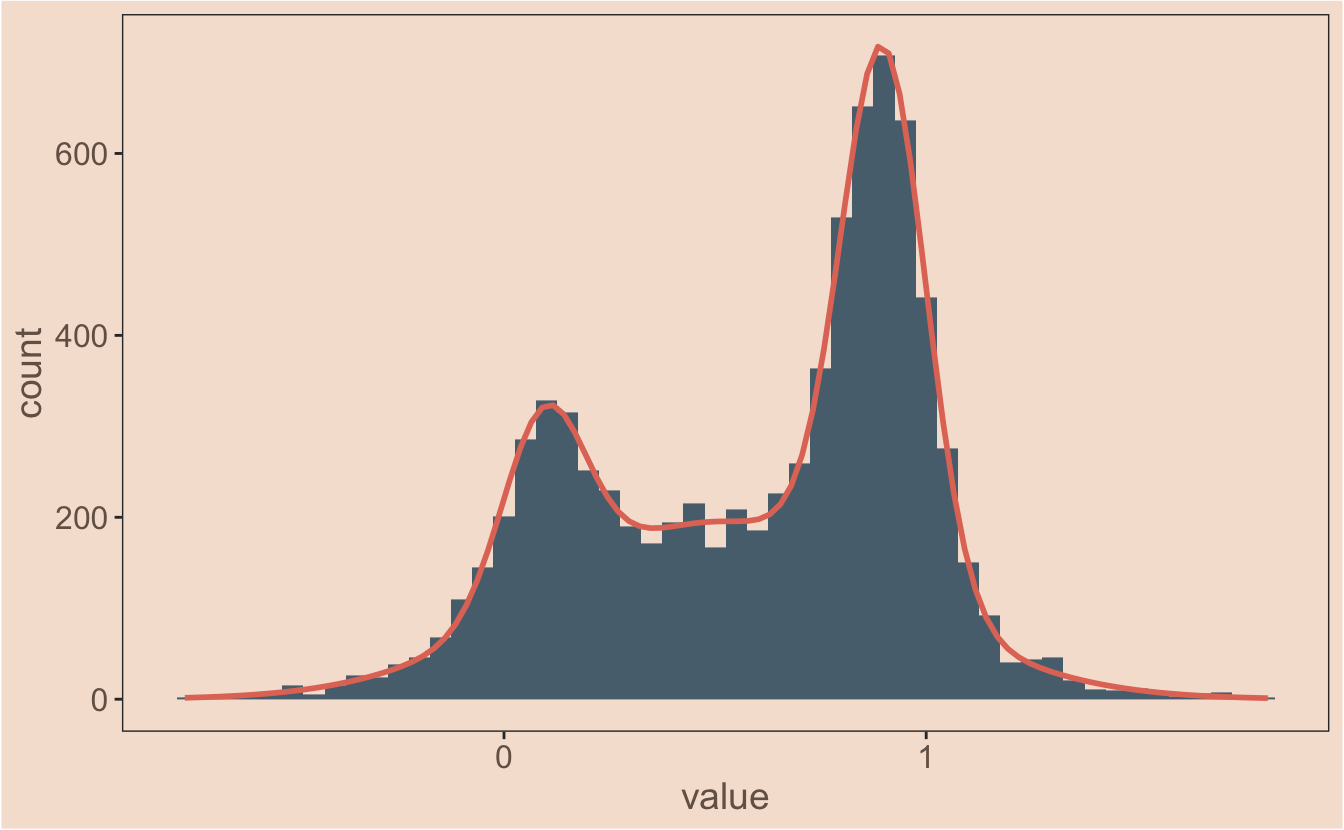
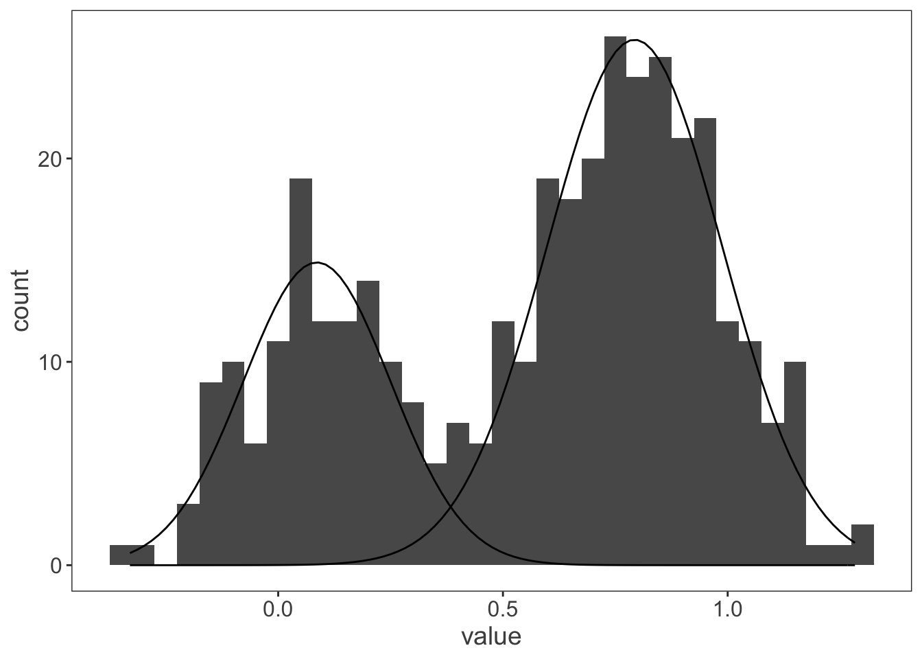
In the previous post I plotted multiple fit gaussians onto a data set with ggplot2 - the final model is actually the sum of these fitted gaussians though, so how do I plot that? This is a more tricksy problem. I know I need to nest the mapply function inside another function, but my mind doesn’t immediately leap to the answer - I tried to come up with something quickly, but it inevitably failed.

Continue reading

This post deals with something niche but practical - getting ggplot2 to plot multiple fitted gaussians from a model with different amplitudes. Google failed to provide the answer I was looking for - if you can’t find it with Google, it must need a blog post. We have a couple of different projects running at the moment that need us to think about mixture models - these are common in single molecule biophysics work as you frequently end up with two or more populations of molecules stretched out along a continuous variable; could be velocity, step size or something else.

Continue reading

I have a bit of a love hate relationship with kymographs. In the way that they compress data there’s no doubt that you loose information, but in the world of axonal transport and low signal:noise they have clear advantages in enabling quantification. I covered before a couple of strategies you can use to import image data into R. The next step in my workflow is usually to turn that image into a data table for further analysis.

Continue reading

Author's picture

Ali Twelvetrees

Research scientist looking at kinesin, dynein and neurons; trying to figure out how stuff moves around inside neurons and how it goes wrong in neurodegeneration.

Vice Chancellor’s Fellow

Sheffield