Turning a kymograph into tidy data using the tidyverse in R
I have a bit of a love hate relationship with kymographs. In the way that they compress data there’s no doubt that you loose information, but in the world of axonal transport and low signal:noise they have clear advantages in enabling quantification.
I covered before a couple of strategies you can use to import image data into R. The next step in my workflow is usually to turn that image into a data table for further analysis. A data table can take many forms, but I think the easiest and most powerful way to get the most out of R these days is to use the tidyverse collection of packages.
I picked up R a few years ago now and since then I’ve happily watched the tidyverse grow and develop. It is a fantastic set of tools accessible to anyone, and it’s easy to see the parallels between ImageJ/FIJI development and the R/tidyverse. To work happily within the tidyverse your data does have to be tidy. Tidy data is a standardized way of mapping the meaning of data to it’s structure (across lots of different types of data). A simple concept in essence, I remember it taking me a while to fully transition from spreadsheets until the penny really dropped. Tidy data is data that conforms to the following rules:
- Each variable describing the data forms a separate column.
- Each observation forms a row and all the parameters you need to describe that observation should be on that row.
- Each type of observational unit forms a table.
If your a beginner to R it’s worth reading Hadley Whickham’s paper on Tidy Data, a very straight forward and useful read.
This is my strategy to turn an image into tidy data for downstream analysis. First up, load the packages we need. The tidyverse
package loads a suite of (currently) 26 packages, but in this example I’m only
actually using functions from tibble, tidyr, forcats and ggplot2. I’m also loading
EBImage to import my data:
library(tidyverse)
library(EBImage)

kymograph <- readImage("MAX_Reslice_of_low_pass_axon_16bit.tif", type = "tiff")
display(kymograph, method = "raster")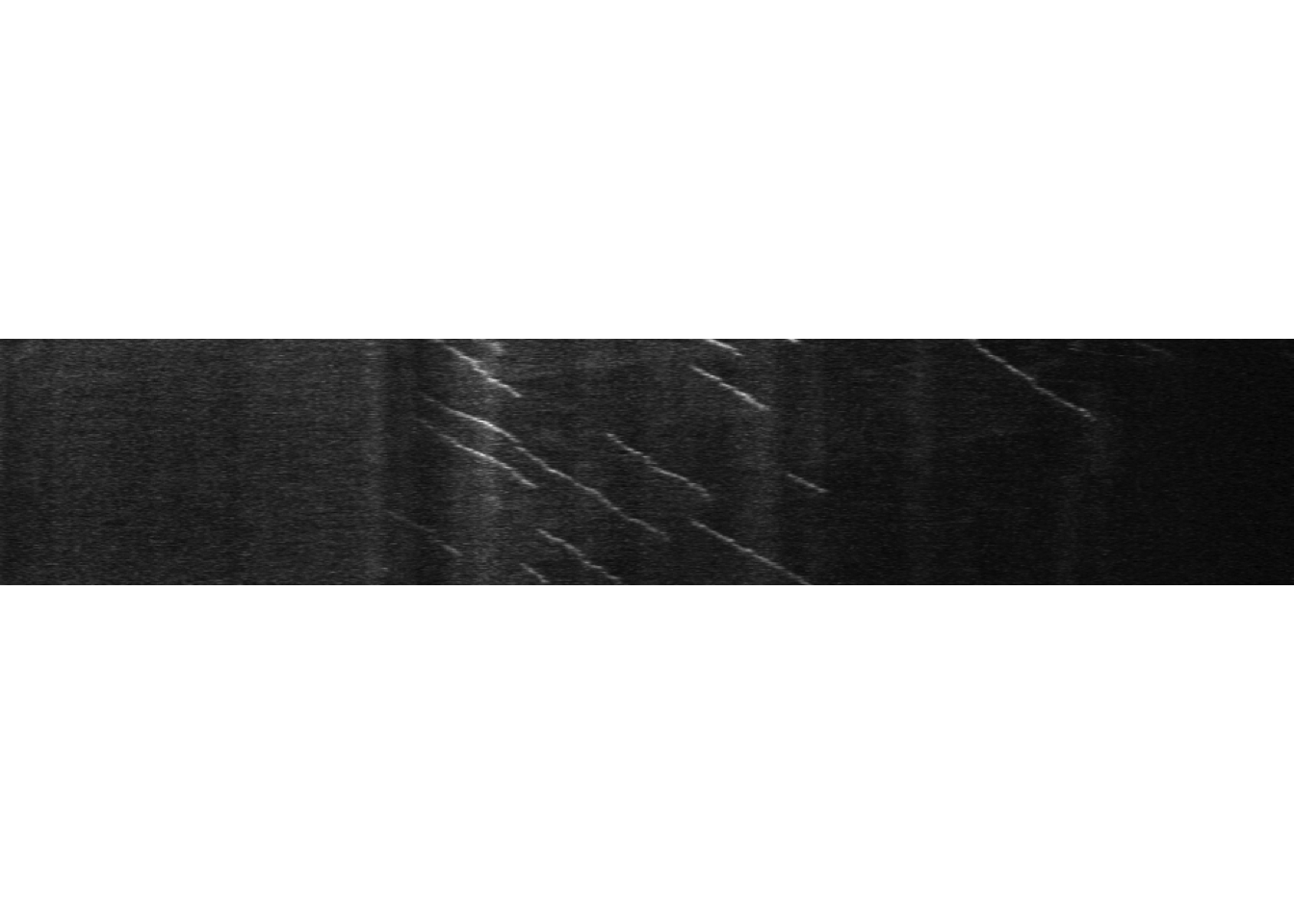
This image is 950 pixels wide and 181 pixels high.
Turning the image into a data table is easy enough, in this case I will turn it
into a tibble - the tidyverse class for storing a data frame - which is faster
than as.data.frame() used in base R.
#' Turn the kymograph tif into a tibble
kymo_data <- as_tibble(kymograph)
## Warning: Calling `as_tibble()` on a vector is discouraged, because the behavior is likely to change in the future. Use `tibble::enframe(name = NULL)` instead.
## This warning is displayed once per session.#' Take a quick peek
kymo_data## # A tibble: 950 x 181
## V1 V2 V3 V4 V5 V6 V7 V8 V9 V10 V11 V12
## <dbl> <dbl> <dbl> <dbl> <dbl> <dbl> <dbl> <dbl> <dbl> <dbl> <dbl> <dbl>
## 1 0.228 0.153 0.253 0.195 0.215 0.308 0.251 0.322 0.277 0.258 0.185 0.278
## 2 0.195 0.165 0.238 0.190 0.230 0.284 0.234 0.273 0.232 0.252 0.189 0.257
## 3 0.178 0.195 0.201 0.178 0.205 0.277 0.213 0.241 0.230 0.251 0.178 0.242
## 4 0.165 0.192 0.157 0.212 0.173 0.292 0.199 0.228 0.195 0.253 0.232 0.273
## 5 0.160 0.205 0.153 0.182 0.130 0.282 0.190 0.231 0.166 0.232 0.256 0.315
## 6 0.161 0.246 0.188 0.181 0.137 0.244 0.196 0.228 0.153 0.235 0.275 0.312
## 7 0.166 0.247 0.199 0.170 0.152 0.187 0.216 0.250 0.161 0.259 0.221 0.295
## 8 0.187 0.201 0.174 0.182 0.164 0.179 0.237 0.263 0.190 0.301 0.229 0.272
## 9 0.195 0.160 0.156 0.185 0.180 0.200 0.253 0.244 0.193 0.301 0.208 0.237
## 10 0.175 0.139 0.148 0.192 0.191 0.193 0.258 0.237 0.186 0.251 0.171 0.263
## # … with 940 more rows, and 169 more variables: V13 <dbl>, V14 <dbl>,
## # V15 <dbl>, V16 <dbl>, V17 <dbl>, V18 <dbl>, V19 <dbl>, V20 <dbl>,
## # V21 <dbl>, V22 <dbl>, V23 <dbl>, V24 <dbl>, V25 <dbl>, V26 <dbl>,
## # V27 <dbl>, V28 <dbl>, V29 <dbl>, V30 <dbl>, V31 <dbl>, V32 <dbl>,
## # V33 <dbl>, V34 <dbl>, V35 <dbl>, V36 <dbl>, V37 <dbl>, V38 <dbl>,
## # V39 <dbl>, V40 <dbl>, V41 <dbl>, V42 <dbl>, V43 <dbl>, V44 <dbl>,
## # V45 <dbl>, V46 <dbl>, V47 <dbl>, V48 <dbl>, V49 <dbl>, V50 <dbl>,
## # V51 <dbl>, V52 <dbl>, V53 <dbl>, V54 <dbl>, V55 <dbl>, V56 <dbl>,
## # V57 <dbl>, V58 <dbl>, V59 <dbl>, V60 <dbl>, V61 <dbl>, V62 <dbl>,
## # V63 <dbl>, V64 <dbl>, V65 <dbl>, V66 <dbl>, V67 <dbl>, V68 <dbl>,
## # V69 <dbl>, V70 <dbl>, V71 <dbl>, V72 <dbl>, V73 <dbl>, V74 <dbl>,
## # V75 <dbl>, V76 <dbl>, V77 <dbl>, V78 <dbl>, V79 <dbl>, V80 <dbl>,
## # V81 <dbl>, V82 <dbl>, V83 <dbl>, V84 <dbl>, V85 <dbl>, V86 <dbl>,
## # V87 <dbl>, V88 <dbl>, V89 <dbl>, V90 <dbl>, V91 <dbl>, V92 <dbl>,
## # V93 <dbl>, V94 <dbl>, V95 <dbl>, V96 <dbl>, V97 <dbl>, V98 <dbl>,
## # V99 <dbl>, V100 <dbl>, V101 <dbl>, V102 <dbl>, V103 <dbl>, V104 <dbl>,
## # V105 <dbl>, V106 <dbl>, V107 <dbl>, V108 <dbl>, V109 <dbl>,
## # V110 <dbl>, V111 <dbl>, V112 <dbl>, …My data table has 950 rows and 181 columns. I admit I have never been entirely clear on why the width of your image ends up as rows in this operation (and have not been sufficiently motivated to find out), but it doesn’t really matter as long as you know the orientation of the data.
The one thing this tibble isn’t at present is tidy. Each pixel in the original image has it’s grey value represented in the table, but if you mixed up the rows and the columns you would have no way of knowing what the position of any one pixel had been in x and y. Tidy data demands that not only does the row contain your grey value, it also contains the position in x and y. How do we do that?
First things first, I need to add a column that describes explicitly what the row
number currently means - the position along the x axis in the image. There are
many ways to add a column. You can use the $ in base R or the mutate() function
from dplyr:
kymo_data$Pixel_position <- 1:nrow(kymo_data) or
kymo_data <- mutate(kymo_data, Pixel_position = 1:nrow(kymo_data))
These are both fine, except that they both append a column to the end of the
table. In order to be able to fully automate the process of import and
conversion, I want to specify the position of the column in the table and have
it be the first column. This is because the next operation is to reshape the
data so that the column names become a new column describing the position on the
y axis, and this is much easier if I can tell the reshaping function to act on
every column after the first with the description 2:last column, where the
last column is the same as the number of columns in the table using ncol. The
add_column function from the tibble package lets me do this with the .before
command. The gather command from the tidyr package then reshapes the data.
If we take a peek at the table after this it looks totally different.
#' Add a column describing the pixel number as the first colum in the table
kymo_data <- add_column(kymo_data, Pixel_position = 1:nrow(kymo_data), .before = 1)

#' Reshape the table so intensity values are in one column (this is why I put the `Pixel` column first)
kymo_data <- gather(kymo_data, 2:ncol(kymo_data), key = "Time_point", value = "Intensity")
kymo_data
## # A tibble: 171,950 x 3
## Pixel_position Time_point Intensity
## <int> <chr> <dbl>
## 1 1 V1 0.228
## 2 2 V1 0.195
## 3 3 V1 0.178
## 4 4 V1 0.165
## 5 5 V1 0.160
## 6 6 V1 0.161
## 7 7 V1 0.166
## 8 8 V1 0.187
## 9 9 V1 0.195
## 10 10 V1 0.175
## # … with 171,940 more rowsThis is very very close to the finished tidy data. There is one last step. The
column names are currently character strings in the Time_point column rather
than numerical time points. The column names when I converted the image to a
tibble were listed as V1, V2, V3 etc because column names aren’t allowed
to be numbers in R. So basically I want to get rid of the V and turn the
character into a number. I could do this by using string functions to get rid of
the V, but as the list here is ordered what I’m going to do instead is turn
the Time_points into ordered factors and then turn the factor levels into
their numeric equivalent.
#' We can check the nature of the values the column with the is.character function
is.character(kymo_data$Time_point)
## [1] TRUE#' Now we tell the characters to become factors with the as_factor function
kymo_data$Time_point <- as_factor(kymo_data$Time_point)
#' Just check they are factors
is.factor(kymo_data$Time_point)## [1] TRUE#' Now turn the factors into numbers
kymo_data$Time_point <- as.numeric(kymo_data$Time_point)
is.numeric(kymo_data$Time_point)## [1] TRUEkymo_data## # A tibble: 171,950 x 3
## Pixel_position Time_point Intensity
## <int> <dbl> <dbl>
## 1 1 1 0.228
## 2 2 1 0.195
## 3 3 1 0.178
## 4 4 1 0.165
## 5 5 1 0.160
## 6 6 1 0.161
## 7 7 1 0.166
## 8 8 1 0.187
## 9 9 1 0.195
## 10 10 1 0.175
## # … with 171,940 more rowsAnd it’s done - The kymograph is now tidy data. But why on earth would you want to do such a thing?!? Well, all the steps I’ve just walked through can be automated into one wrapper function. You don’t need to think this hard every time. And once your data is in the table you can start the real work of analysis. You also get to do cool things like this:
library(ggridges)

plot <- kymo_data %>% ggplot(., aes(x = Pixel_position, y = max(Time_point)-Time_point, group = Time_point, height = Intensity))
plot +
  geom_ridgeline(scale = 5, fill = "#33CCCC", colour = "white", size = 0.25) +
  coord_cartesian(xlim = c(300, 800)) +
  theme_classic() +
  theme(axis.title = element_blank(),
        axis.text = element_blank(),
        axis.ticks = element_blank(),
        axis.line = element_blank(),
        panel.background = element_rect(fill = "#33CCCC"),
        panel.border = element_blank(),
        panel.spacing = unit(c(0,0,0,0),"cm")
  )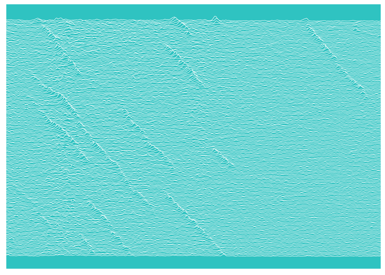
The ggridges package was created as a ggplot2 extension to allow ridge line
plots, specifically plots inspired by the Joy Division Unknown Pleasures album
cover (the resulting plots were originally called joy plots). I had been messing
around with trying to create a version of this plot for some of my kymograph
data, just because I thought it would look cool. ggridges is far
more elegant than my solution, although the jury is out on whether this is
anything other than an aesthetic plot at this point, I do like it.
In the process of my research though I did discover that the history of that original plot is quite interesting. I had at some point thought that the Unknown Pleasures stacked plot was actually Dame Jocelyn Bell Burnell’s representation of a pulsar - turns out I was wrong. It was created by Harold Craft, a radio astronomer at the Arecibo Radio Observatory. For fellow data presentation nerds I thoroughly recommend the following two articles; Adam Cap’s own account of his hunt for the origin of the image and the Origin story by Jen Christiansen over at Scientific American. Finally, here is an extract from Craft on the stacked plots:
So, the thought was, well, is there something like this peak here, which on the next pulse moves over here, and then moves over here, and over there … So, then the thought was, well let’s plot out a whole array of pulses, and see if we can see particular patterns in there. So that’s why, this one was the first I did – CP1919 – and you can pick out patterns in there if you really work at it. But I think the answer is, there weren’t any that were real obvious anyway.
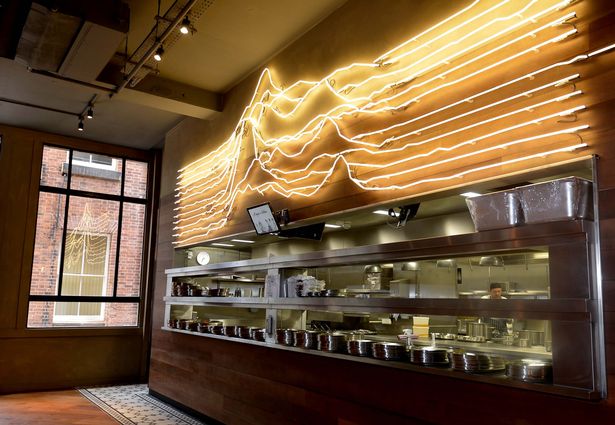
I think what’s interesting is that they were looking for things moving with these plots, and that is absolutely what a kymograph is for. What’s good enough for pulsars is good enough for axonal transport :) And if anyone wants to gift me a neon kymograph for the office wall, that would be awesome…